By now, I think we have all had exposure to the “new Facebook.” For those readers who don’t know what that refers to, it is basically a complete redesign of the social networking site Facebook, which the developers have been working on for some time now. Since 2004 when Facebook was first launched and created, the design of the site has remained the same, where a person’s personal profile is viewable on one single page, and links to get to other parts of the site were in familiar and convenient places on that page. But Facebook has been expanding to include new features, like “pages” (i.e. pages devoted to people, places and things, which users can become “fans” of — see our Library page for an example: The University of Scranton Weinberg Memorial Library ), and interactive applications (widgets or add-ons to your profile, created by 3rd parties, that allow for more ways to interact). The Facebook design crew felt the structure of the site could be improved to handle all of these new features, and so they redesigned the whole site, and made the switch from “old” to “new” voluntary for the past month and a half or so.
Until late last week, when the option to revert back to the old Facebook was taken away from users… (See this article by Michael Liedtke of the Associated Press for more details on this.)
And the reaction has been pretty strong! Three out of 5 stories on my newsfeed these days are of my friends joining groups like “6,600,000,000 Against the New Facebook!” and “Petition against the ‘New Facebook.'” And here I am… not minding the new design at all, and in fact digging it for various reasons. It makes a gal feel as if she didn’t get the memo that said to dislike the new Facebook with a passion, when everyone she knows is having such a strong negative reaction to this change, and she is not.
And so, for your reading and discussing pleasure, here are my top 5 reasons for liking the new Facebook:
1. Home Tabs:
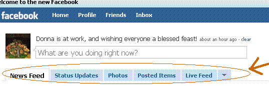
I like these tabs on my “Home” page because they organize all of the information about my friends that I care about. The 2 tabs I use most often are “Status Updates” and “Photos.” I have heard criticisms that this new accessible layout increases the opportunity for people to “Facebook stalk” their friends. But answer me this: When you sign into Facebook, other than updating your friends on what’s new with you, isn’t your next interest, well, finding out what’s new with them? I mean, come on, if someone is your friend on Facebook, I’d like to hope they aren’t gonna “Facebook stalk” you — and hey, if you think they are, then you can change your privacy settings regarding what gets published in newsfeeds about you. These tabs mean less pages to load, in order to see what people have updated about themselves. Which is one of the reasons I sign into Facebook in the first place. So, I like ’em.
2. Profile Tabs:
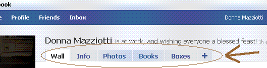
This is possibly my favorite change. You can’t tell me that, in the old Facebook, you didn’t find it annoying that it took so long for most people’s profiles to load with 50 applications attached to each one. The single-page-per-profile layout of the old Facebook was so cumbersome and slow, I love that the Facebook designers have now tucked most of our crazy applications behind a tab called “Boxes,” making the load time for profiles a lot shorter. I also think it’s neat that “Info” is clustered under one tab as well — let’s face it, sometimes we are interested in seeing where our friends work and what movies they have listed, and sometimes we’re not. When we’re not, we’re usually more interested in seeing who’s posted on their Wall lately — or, to make that sound less “Facebook stalkerish,” what sorts of social interactions they’ve been engaging in recently. And there is nothing wrong with this, as far as I’m concerned. The site is designed for us to interact — I’m not gonna pretend that’s not why I use it. Along these lines, on the old Facebook my click pattern was to click on a person’s name to get to their profile, and then speed-scroll down to their Wall. In the new Facebook, all that clicking, and loading, and waiting, and scrolling is eliminated. I like it.
3. Photo Tab:
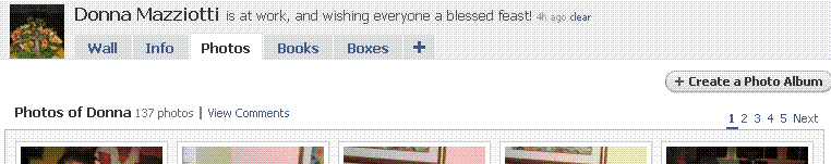
And scrolling down on the same page you find:
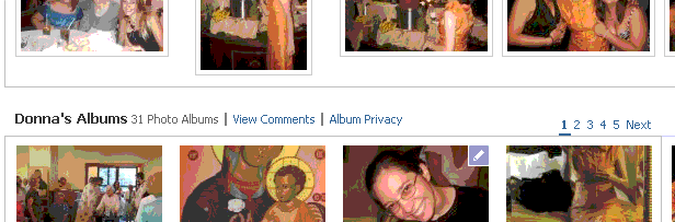
I think the new photo tab is brilliant in its simplicity… Now, ALL of my photos are in one place. I don’t have to click one link to see tagged photos of me (first screen shot above), and another link to view the albums I have created (second screen shot above). When you click on a person’s Photo tab, all of their photos are on the same page, in one place. You also have a convenient button to “Create a Photo Album” right on your own Photo tab. All of this just makes more sense to me.
4. Customization:
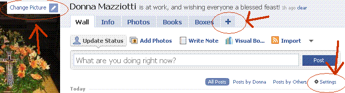
I like that the new Facebook has buttons all over the place for you to immediately make changes to the content on your profile and on your newsfeeds. Note in particular the “Settings” button I circled in the above screenshot (right side). I admit I didn’t like the default settings for my “Wall” tab, since it was publishing stories about every little thing I did on any of my applications… So I just clicked on the convenient “Settings” button and made it so the only stories that get published on my page are for status updates or posts from my friends to my Wall. You can do this for your general newsfeed (on your “Home” page) as well. I can also change my profile picture really easily using the “Change Picture” button (see upper left corner of screenshot) which has a picture of a little pencil next to it… You will find these little pencils everywhere, and they are Edit functions, there to make it easy for you to change the content of your page. Very convenient and considerate of Facebook, if you ask me…
5. Accessibility of Applications:
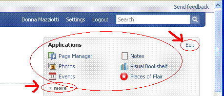
Finally, I like what Facebook did with my applications. I can now access them very easily from my “Home” page, in the upper right-hand corner of the page, which is where the above screenshot comes from. Note especially the “more” button, which will expand the box to list every single application you have. You can also drag applications from below the “more” boundary so that your most often used applications are always visible. I also love that there is yet another “Edit” button right there next to the apps, which means I can go in and purge my Facebook account of unused or unwanted apps, just one accessible click away. “Edit” will also take me to the page where I can change settings for individual apps, so I stop getting emails every single time someone interacts with one of my applications, etc. This is very convenient and helpful, to me.
And so, there you have it. Perhaps my clicking patterns and behavior on Facebook are different than yours… and if that’s the case, maybe these changes I have listed don’t affect your use of the site at all. If so, I would love to hear some feedback from you avid Facebook users out there, as to why the new layout DOESN’T work for you. Because honestly, I see nothing wrong, and lots right with it… But I am open and very interested in the other point of view, since I want to understand where all the resistance to the new design is coming from.
So, discuss.
(Now, if only Facebook would fix the chat function so that it works more consistently and wasn’t so glitchy, I’d be even happier!)