Going digital

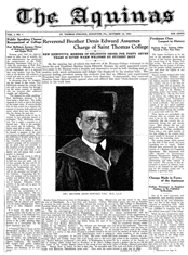
A page from "Prominent Men of Scranton and Vicinity," one of WML's newly digitized books
A page from “Prominent Men of Scranton and Vicinity”

This fall, the Weinberg Memorial Library is one of 14 institutions participating in a mass digitization pilot project.  The program is headed by PALINET, a network of more than 600 libraries, archives, and museums  in the mid-Atlantic region, with a goal of making electronic copies of interesting books available to the public via the internet.

So far, we’ve had six local history books digitized by Internet Archive.   All six were written before 1923, which means means that they’re in the public domain – so we can post them on the internet without violating anyone’s intellectual property rights.  What’s fantastic about the digitized books is that:

  1. they’re now accessible to anyone, anywhere, anytime (while the physical books are only available to people who visit the WML Special Collections library in person, during limited hours), and
  2. they’re full-text searchable!

Check out our books on the Internet Archive website here.  You can browse through the books using the “flip book” viewer, and you can also download PDF copies of each book.  If your family is from the area, be sure to use the full text search box in the flip book viewer to search for your last name – the books are great resources for genealogists.  Or just look at the great pictures, like this 1882 line drawing of the proposed design for the Lackawanna County Courthouse from “Memorial of the Erection of Lackawanna County” (if it looks a bit different from what you see on the Square today, it is!) —

Proposed Lackawanna County Courthouse, 1882

Happy Fall Break!!


The leaves of Northeastern PA


Now that midterms are over, take a walk outside and enjoy the beautiful weather and amazing foliage that Fall has brought us!! 

The Library is closed until Tuesday, October 14th, when we will reopen at our regular hours of 8am-11:30pm. 

We look forward to seeing everyone refreshed and ready for the second half of the semester… See you then!

Banned Books Week

Since 1982, the American Library Association has declared the last week of September as “Banned Books Week.” According to ALA, “BBW celebrates the freedom to choose or the freedom to express one’s opinion even if that opinion might be considered unorthodox or unpopular and stresses the importance of ensuring the availability of those unorthodox or unpopular viewpoints to all who wish to read them. After all, intellectual freedom can exist only where these two essential conditions are met.”

To learn more about Banned Books, check out the ALA website. We also have a copy of ALA’s Banned Books Resource Guide in our Reference collection here at the Library. And don’t forget to check out our display on Banned Books, which you can find in the Quiet Study room on the 4th floor of the Weinberg.

Here’s a list of the top 10 books challenged in 2007 – have you read any?

1) “And Tango Makes Three,” by Justin Richardson/Peter Parnell
Reasons: Anti-Ethnic, Sexism, Homosexuality, Anti-Family, Religious Viewpoint, Unsuited to Age Group

2) “The Chocolate War,” by Robert Cormier
Reasons: Sexually Explicit, Offensive Language, Violence

3) “Olive’s Ocean,” by Kevin Henkes
Reasons: Sexually Explicit and Offensive Language

4) “The Golden Compass,” by Philip Pullman
Reasons: Religious Viewpoint

5) “The Adventures of Huckleberry Finn,” by Mark Twain
Reasons: Racism

6) “The Color Purple,” by Alice Walker
Reasons: Homosexuality, Sexually Explicit, Offensive Language,

7) “TTYL,” by Lauren Myracle
Reasons: Sexually Explicit, Offensive Language, Unsuited to Age Group

8) “I Know Why the Caged Bird Sings,” by Maya Angelou
Reasons: Sexually Explicit

9) “It’s Perfectly Normal,” by Robie Harris
Reasons: Sex Education, Sexually Explicit

10) “The Perks of Being A Wallflower,” by Stephen Chbosky
Reasons: Homosexuality, Sexually Explicit, Offensive Language, Unsuited to Age Group

Need Journal Articles from 1865?

Then JSTOR is a database you want to try.

If you are looking for journal articles from as far back as 1865, this database will provide them for you, and in .PDF full-text format too. Here’s how you would run a search for your topic, in order to find articles about that topic, which were written in bygone days:

  • Select JSTOR on our A-Z List of Databases.
  • The way to narrow your search to find journal articles from a specific time period is to place a check-mark in the box next to “Article” under “Limit To: Type:” and then to put the range of years you are looking for in the “Limit To: Date Range:” fields. So, for example, if I want journal articles on my topic from the years 1865-1940, I will check off “Articles” and then put “From: 1865” and “To: 1940.”
  • Then, type your search topic into the Advanced Search field at the top of the page. Keep in mind that your topic may have been called by a different name back in the 1800s!
  • Then click “Search,” look for article titles that cover what you need, click into them to read the abstracts (summaries) as needed, and select the .PDF option for viewing, printing and saving the articles for your research.

Remember, if you’re working from home or your dorm, make sure you first sign into My.Scranton.edu, and then select “A-Z Database Listing” from inside the Library tab. This way, when you eventually get to JSTOR, the database will recognize you as a student, and it will let you access the full-text .PDF of the articles you need.

Ever wonder what was being written about, say, librarians, in the late 1800s-early 1900s? Go give the search a try to find out!* There is one very interesting article from 1929 about a study of ways that librarians cultivated “wholesome reading interests” back then (“Methods Employed to Stimulate Interests in Reading. I” by William F. Rasche, from The School Review, Vol. 37, No. 1 (Jan., 1929), pp. 29-36) — very interesting indeed.

*So, okay, I know most of you probably don’t care about librarians and our fascinating history as public figures in the community… Ahem. But! Whatever your research interest is (for instance, I know there’s an assignment going around about researching the same social issue in 3 different historical time periods) JSTOR is a great place to start in your search for old journal articles on the topic.

Before You Vote, Surf

The 2008 presidential election is coming up quickly — only 40 more days until November 4th!

With all of the debates, town halls, news stories, and sound bites, it’s hard to keep up with all of the information from and about the candidates – even if you are a devoted CSPAN viewer.  And, here in the Library, we encourage everyone to examine information from several sources and think critically about a source’s accuracy, reliability, validity, and potential bias.  So I thought it might be a good idea to highlight a few useful news and fact-checking websites to help you make an informed decision on Election Day.

One of my favorites is the non-partisan Annenberg Political Fact Check, aka FactCheck.org.  The site reviews political ads and commercials from both campaigns and checks to see whether their statements are accurate.  They also answer “questions of the day,” submitted by the public, to help you understand the background behind various rumors and accusations — today’s is “Did Sarah Palin make rape victims pay for their own rape kits?” (Answer: “Palin’s police chief in Wasilla did that. Whether Palin supported this is not certain”).

As a recent transplant from Virginia, I’m also a fan of a Washington Post blog called “The Fact Checker,” where blogger Michael Dobbs grades the candidates’ claims.  He assigns between 1-4 “Pinocchios” to let you know whether a statement was absolutely true, completely false, or somewhere in the middle (for example, true but misleading).  The Post also has a neat 2008 Campaign Toolbox, filled with links to up-to-date news, polls, and analysis.  CNN has a similar site, the Election Center 2008.

Of course, after digesting all of this political information, you’ll need a break! That’s when it’s time to go watch a few episodes of The Daily Show.

Most importantly, though, don’t forget to register to vote.  There’s been a table for voter registration in DeNaples every day during lunch, or you can download a Pennsylvania voter registration form (and find out more about voting in Pennsylvania) at www.votesPA.com, a website published by the Pennsylvania Department of State.  And let us know where *you* find your election information, by posting a comment.

Project MUSE now on our Facebook page

Exciting news! The article database Project MUSE has now designed an application for Facebook. “The University of Scranton Weinberg Memorial Library” (found here) has just added the Project MUSE search box to our FB Page, which means you can search for articles right from inside Facebook. I just tested it out, and it definitely works, allowing you to open the full-text .PDF’s of articles in your results list.

There’s a possibility if you use the search box from home, you’ll be prompted for your My.Scranton username and password — but just type these in and you should have access to the full-text articles in this database.

This is a step in the direction of giving you guys full article searching and access capabilities from right inside Facebook, which is our ultimate goal.

So, give it a try! And if you hit a dead end, or for some reason you aren’t able to access the full-text of articles in your results list, definitely let us know (leave a Wall comment or post in the discussion forums on our FB page) so we can fix the problem.

Just for fun: try running a search for “Pittsburgh Steelers” (I know, such a scholarly topic :-P ) and yinz should check out the .PDF of the 2nd hit in the results list! (And I’m not even a Pittsburgh native — just an adoring Steelers fan who laments their loss to Philly tonight. *sigh*)

Update from the Schemel Forum

It’s now week three of this semester’s Schemel Forum on the American Presidency, and the debates just keep getting more interesting.  Today, we were talking about the extents of executive power, and two of the philosophers present mentioned John Locke‘s views on the power of a sovereign.  Locke wrote in his Treatises of Government that a sovereign could act beyond the law under certain conditions – for example, if no laws yet existed to provide rules for a certain circumstance, or if the preservation of the public welfare were at stake.  The hope was that the sovereign would be a wise enough ruler that these decisions could safely be left up to his discretion.  We talked about how this idea could apply to the American presidency today – how far can the president go beyond stated laws in a time of emergency to protect the public?

We only have two weeks left, and lots of material left to cover.  I’m anxious to hear the debates about executive privilege and “signing statements.” The last session on Guantanamo Bay also promises to be intriguing.

If you’re interested in the Schemel Forum, now is a great time to sign up for two of the upcoming Forums — Dr. William V. Rowe from the University of Scranton’s philosophy department will present a five-week forum in October on “Think World: Reflections on our Times,” and Father McKinney, also from the philosophy department, will present a three-week forum in November called “The Role of Drama in the Jesuit Tradition.”  For more information, or to sign up to participate, contact Kym Fetsko at 570-941-7816.

The Fall Library Newsletter is Out

The Fall 2008 edition of the Weinberg Memorial Library Information Update Newsletter is now out. Included are articles on the LibQUAL+TM assessment survey; news from Special Collections; the Letters to Sala Exhibit; the upcoming Abraham Lincoln Exhibit; updates on the Patriot Act and other related legislation; and news about the Center for Teaching and Learning Excellence and Assistive Technology. The Information Update is published twice a year at the beginning of the Fall and Spring semester. A paper copy can be picked up at the Library Reference or Circulation Desks; an online copy along with past issues can be accessed from the Library homepage or by linking to http://academic.scranton.edu/department/wml/newsletter.html.

A case for the new Facebook

By now, I think we have all had exposure to the “new Facebook.” For those readers who don’t know what that refers to, it is basically a complete redesign of the social networking site Facebook, which the developers have been working on for some time now. Since 2004 when Facebook was first launched and created, the design of the site has remained the same, where a person’s personal profile is viewable on one single page, and links to get to other parts of the site were in familiar and convenient places on that page. But Facebook has been expanding to include new features, like “pages” (i.e. pages devoted to people, places and things, which users can become “fans” of — see our Library page for an example: The University of Scranton Weinberg Memorial Library ), and interactive applications (widgets or add-ons to your profile, created by 3rd parties, that allow for more ways to interact). The Facebook design crew felt the structure of the site could be improved to handle all of these new features, and so they redesigned the whole site, and made the switch from “old” to “new” voluntary for the past month and a half or so.

Until late last week, when the option to revert back to the old Facebook was taken away from users… (See this article by Michael Liedtke of the Associated Press for more details on this.)

And the reaction has been pretty strong! Three out of 5 stories on my newsfeed these days are of my friends joining groups like “6,600,000,000 Against the New Facebook!” and “Petition against the ‘New Facebook.'” And here I am… not minding the new design at all, and in fact digging it for various reasons. It makes a gal feel as if she didn’t get the memo that said to dislike the new Facebook with a passion, when everyone she knows is having such a strong negative reaction to this change, and she is not.

And so, for your reading and discussing pleasure, here are my top 5 reasons for liking the new Facebook:

1. Home Tabs:

I like these tabs on my “Home” page because they organize all of the information about my friends that I care about. The 2 tabs I use most often are “Status Updates” and “Photos.” I have heard criticisms that this new accessible layout increases the opportunity for people to “Facebook stalk” their friends. But answer me this: When you sign into Facebook, other than updating your friends on what’s new with you, isn’t your next interest, well, finding out what’s new with them? I mean, come on, if someone is your friend on Facebook, I’d like to hope they aren’t gonna “Facebook stalk” you — and hey, if you think they are, then you can change your privacy settings regarding what gets published in newsfeeds about you. These tabs mean less pages to load, in order to see what people have updated about themselves. Which is one of the reasons I sign into Facebook in the first place. So, I like ’em.

2. Profile Tabs:

This is possibly my favorite change. You can’t tell me that, in the old Facebook, you didn’t find it annoying that it took so long for most people’s profiles to load with 50 applications attached to each one. The single-page-per-profile layout of the old Facebook was so cumbersome and slow, I love that the Facebook designers have now tucked most of our crazy applications behind a tab called “Boxes,” making the load time for profiles a lot shorter. I also think it’s neat that “Info” is clustered under one tab as well — let’s face it, sometimes we are interested in seeing where our friends work and what movies they have listed, and sometimes we’re not. When we’re not, we’re usually more interested in seeing who’s posted on their Wall lately — or, to make that sound less “Facebook stalkerish,” what sorts of social interactions they’ve been engaging in recently. And there is nothing wrong with this, as far as I’m concerned. The site is designed for us to interact — I’m not gonna pretend that’s not why I use it. Along these lines, on the old Facebook my click pattern was to click on a person’s name to get to their profile, and then speed-scroll down to their Wall. In the new Facebook, all that clicking, and loading, and waiting, and scrolling is eliminated. I like it.

3. Photo Tab:

And scrolling down on the same page you find:

I think the new photo tab is brilliant in its simplicity… Now, ALL of my photos are in one place. I don’t have to click one link to see tagged photos of me (first screen shot above), and another link to view the albums I have created (second screen shot above). When you click on a person’s Photo tab, all of their photos are on the same page, in one place. You also have a convenient button to “Create a Photo Album” right on your own Photo tab. All of this just makes more sense to me.

4. Customization:

I like that the new Facebook has buttons all over the place for you to immediately make changes to the content on your profile and on your newsfeeds. Note in particular the “Settings” button I circled in the above screenshot (right side). I admit I didn’t like the default settings for my “Wall” tab, since it was publishing stories about every little thing I did on any of my applications… So I just clicked on the convenient “Settings” button and made it so the only stories that get published on my page are for status updates or posts from my friends to my Wall. You can do this for your general newsfeed (on your “Home” page) as well. I can also change my profile picture really easily using the “Change Picture” button (see upper left corner of screenshot) which has a picture of a little pencil next to it… You will find these little pencils everywhere, and they are Edit functions, there to make it easy for you to change the content of your page. Very convenient and considerate of Facebook, if you ask me…

5. Accessibility of Applications:

Finally, I like what Facebook did with my applications. I can now access them very easily from my “Home” page, in the upper right-hand corner of the page, which is where the above screenshot comes from. Note especially the “more” button, which will expand the box to list every single application you have. You can also drag applications from below the “more” boundary so that your most often used applications are always visible. I also love that there is yet another “Edit” button right there next to the apps, which means I can go in and purge my Facebook account of unused or unwanted apps, just one accessible click away. “Edit” will also take me to the page where I can change settings for individual apps, so I stop getting emails every single time someone interacts with one of my applications, etc. This is very convenient and helpful, to me.

And so, there you have it. Perhaps my clicking patterns and behavior on Facebook are different than yours… and if that’s the case, maybe these changes I have listed don’t affect your use of the site at all. If so, I would love to hear some feedback from you avid Facebook users out there, as to why the new layout DOESN’T work for you. Because honestly, I see nothing wrong, and lots right with it… But I am open and very interested in the other point of view, since I want to understand where all the resistance to the new design is coming from.

So, discuss.

(Now, if only Facebook would fix the chat function so that it works more consistently and wasn’t so glitchy, I’d be even happier!)